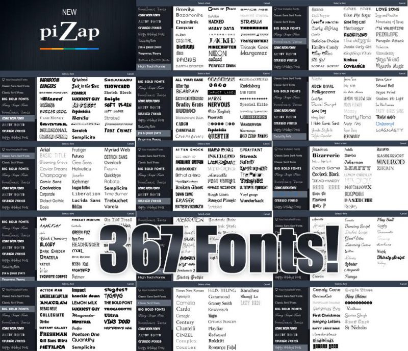
 Fonts. It may not be something you think about on a regular basis (ever?), but it’s certainly something we think about. In fact, we think about it so much we recently bulked up our font offerings, so now we have 367 to choose from!
Creating eye-popping designs with font combinations are actually an easy way to elevate your photo-editing game. Seriously. Have you ever considered what sets apart amazing design from ok design? More often than not, it’s fonts.
Now that we have that behind us, let’s talk about some easy “rules” to follow when creating your design.
How to Create Font Combinations that Rock!
Consider the Intent
Fonts show personality. For example, a kids birthday party invitation may warrant a bubbly font like Jack in the Box, while a Halloween invitation will look more interesting with a jagged font like Exquisite Corpse.
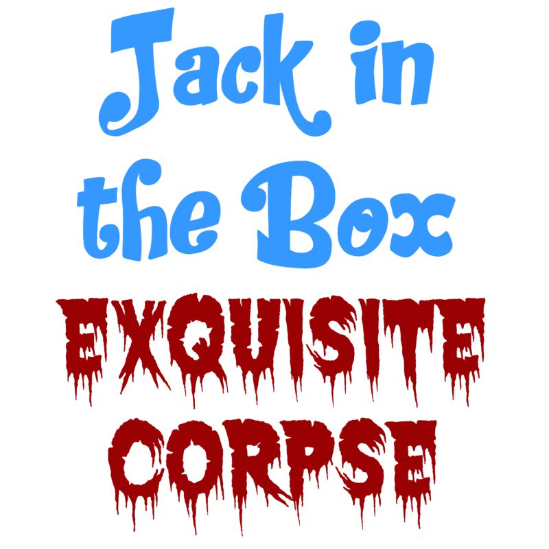
Fonts personalities can serious, casual, playful, elegant, so make sure your font choices match the purpose of your design.
Combine Well
Now that you know fonts have personalities, it’s time to take it a step further… within the font personality resides “extroverts” and “introverts” and they happen to balance each other quite nicely. The point is, you don’t want two strong fonts competing for attention. Your design needs some yin-yang balance.
Here are a few examples:
Champagne and Trashed

Redressed and Dosis

Serif and Sans Serif
Now, let’s get a little techy-geeky. In classic font-land (it’s a place, didn’t you know?) there are two basic font classifications: Serif and Sans Serif.
Serif is a type of font that includes a little extra pizazz, so to speak. The tip of a S will have edges, a C will have a tip. It’s a traditional, old-Timeyish look that many perceive as trustworthy.
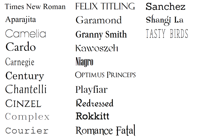
Sans Serif, on the other hand, is without the extras, hence “sans”. These font styles are considered to be more modern and clean.
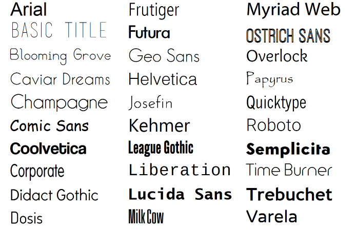
Here’s the genius… it’s OK to mix and match Serif and Sans Serif! These two styles tend to compliment one another especially when used in contrasting sizes.
Beyond the Basics
Here’s where it gets fun at piZap, our font options actually go a step beyond the basis font classifications of Serif and Sans Serif and the mixey-matchy awesomeness of possibilities are unlimited, though we’d suggest you combine with restraint.
We have Big Bold Fonts, Fancy Script Fonts, Sweetheart Fonts, Comic Book Fonts, Artist Fonts, Grunge Fonts, Happy Holidays Fonts, Handwriting Fonts, Fun & Unique Fonts, Frightful Fonts, Tattoos & Graffiti Fonts, and High Tech Fonts.
Each of these fonts should be used in combination with the Classic Serif and Sans Serif Fonts for a bold, cohesive look.
Think Like a Magazine
Ok, now that you have the lowdown on personalities and types of fonts, let’s get to the good stuff. In order to make your design work well, you should think like a magazine… consider the visual hierarchy with headlines, sub-headlines, and body text.
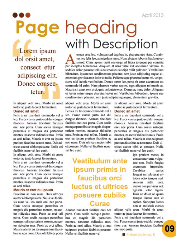
Do you see how the above example uses Serif and Sans Serif together throw the natural hierarchy of the layout? That same concept goes into your design, no matter what the purpose. Consider the hierarchy and use fonts for each section of it.
Janda Stylish and Quicktype
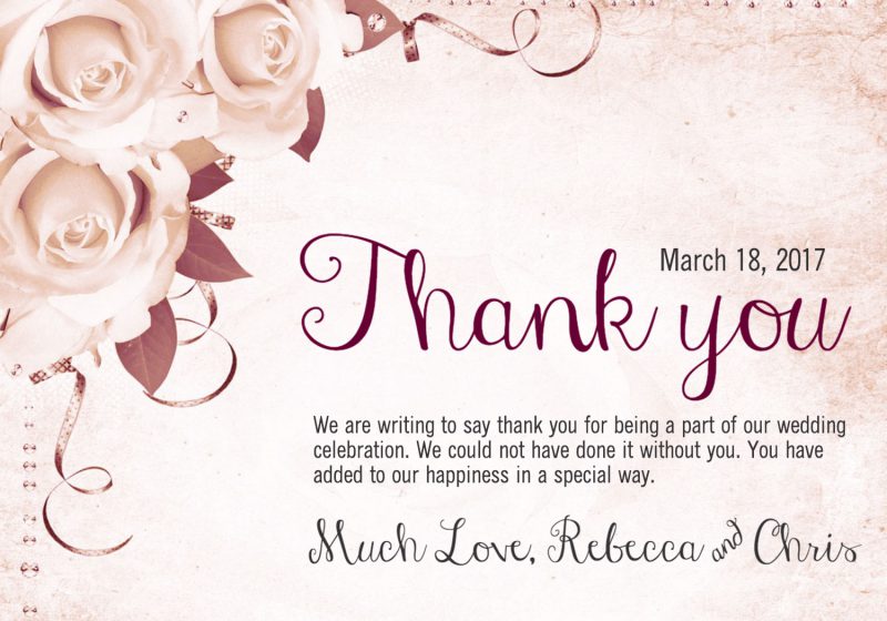
The key to success when it comes to creating a design that pops is to be mindful of your font combinations. Don’t overdo it by combining TOO many styles. Think about what the design is for and how your font can play into the overall feeling of it. Think like a magazine with headings, subheadings and body text, and compliment each section with it’s own style.
Now that you have these rules in place, it’s time to have some fun. Head on over to piZap and check out all our amazing choices, then be sure to tag us in your creations!
