Creating an impactful YouTube banner is crucial as it’s the first thing viewers notice on your channel. Let’s delve into the best practices for creating the perfect YouTube banner with the help of piZap, and provide you with some image samples that could be used as templates or inspiration.
Understanding the ideal YouTube banner size, implementing the best design practices, and using the right channel art templates can make the difference between a passing glance and a new follower. Here’s your guide to optimizing your YouTube presence with the perfect banner.
Unlocking the Secrets to the Perfect YouTube Banner Size
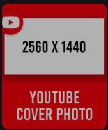
Before diving into the design, let’s talk about dimensions. The optimal YouTube channel art dimensions are 2560 x 1440 pixels. That’s the total size, but due to the variety of devices users may be viewing your channel on, not all parts of your banner will be displayed all the time. Your YouTube banner needs to be adaptable, ensuring your core message comes through on any device.
The key areas to focus on are:
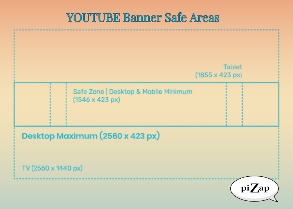
- Desktop: 2560 x 423 pixels, where the central content should be concentrated.
- Tablets: 1855 x 423 pixels, slightly larger than the desktop safe area.
- Mobile: 1546 x 423 pixels, the smallest safe area, crucial for mobile-first users.
- TV displays: 2560 x 1440 pixels, the full size of your banner will be displayed.
Best YouTube Banner Practices to Captivate Your Audience
- Stay within the Safe Area: Always keep your text and logo within the central 1546 x 423 pixels. This ensures that your key information is visible on all devices.
- High-Quality Images: Choose a high-resolution background image that represents your channel’s content and personality. Blurry or pixelated images can seem unprofessional.
- Brand Consistency: Make sure your banner aligns with your brand’s colors, fonts, and style. Consistency across all your social media platforms is key to brand recognition.
- Minimal Text: Keep text to a minimum. Your banner is not the place for information overload. A simple tagline or your channel’s name is sufficient.
- Update Regularly: Change your banner to reflect any updates or special events happening on your channel. Keep it fresh and relevant.
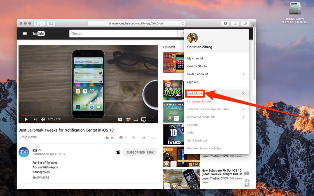
- Optimize for Dark Mode: With many users switching to dark mode on their devices, ensure your design is still impactful when the background is dark.
Incorporating YouTube Banner Design Tips
When designing with piZap, you can start with one of piZap’s YouTube channel art templates and customize it to your needs. Remember to incorporate YouTube banner design tips such as:
- Keeping text readable and within the safe area.
- Using high-quality images to avoid pixelation.
- Making sure the design reflects your channel’s brand and content.
- Staying consistent with your overall color scheme and fonts.
- Utilize Templates: Leverage YouTube channel art templates to start your design. Templates provide the perfect canvas for creativity without the worry of incorrect dimensions.
- Hierarchy of Information: Decide what’s most important for your viewers to know and make that the focal point.
- Contrast and Legibility: Use contrasting colors for text and background to ensure readability.
- Reflect Your Content: Give viewers a sneak peek into what your channel offers through imagery or snapshots of your content.
- Avoid Clutter: A clean, straightforward design can be far more striking than a busy, cluttered banner.
Crafting Your Banner with the Future in Mind
Creating the perfect YouTube banner is not just about the initial upload. It’s about designing with adaptability and future updates in mind. As your channel grows, so too might your branding and content strategy. Keeping the fundamentals in mind ensures your YouTube banner remains an asset rather than a relic.
Remember, your banner is a powerful tool in your YouTube toolkit. With these tips and a sharp focus on the ideal YouTube banner size and best practices, you’re well on your way to creating a visual identity that resonates with viewers and sets the stage for your content to shine.
The right YouTube banner size and design can speak volumes about your channel’s quality and your professionalism as a creator. Use these insights and best practices to craft a banner that not only fits perfectly across all devices but also captures the essence of your brand, leaving a lasting impression on your audience. Your banner is the prologue to your channel’s story—make it count.
By utilizing these guidelines and piZap’s intuitive editing tools, you’ll be well on your way to crafting an engaging YouTube banner that resonates with your audience and strengthens your brand presence online.
Remember, your banner is an integral part of your channel’s identity, so invest the time in getting it right with these best YouTube banner practices and the versatile editing capabilities of piZap.
